Radiance Foundation
Coverage That Celebrates Melanin. A complexion concept built around undertone, coverage, finish, luminosity and the depth of melanated skin.
 LuCre8z
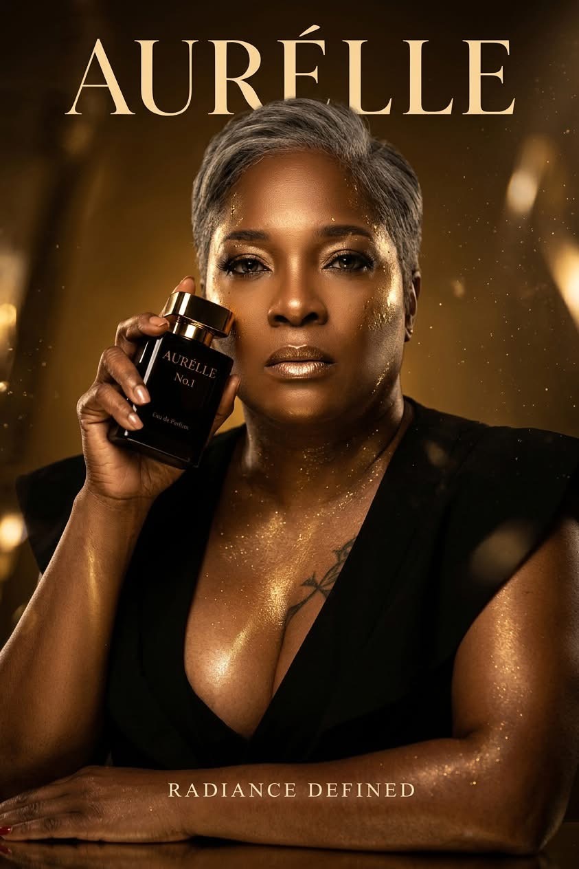
LuCre8z Concept Brand · Beauty Brand + Product Experience
RADIANCE DEFINED.
A premium beauty world created to place melanated skin at the center of the experience.
Case Study / Makiya Lesley · LuCre8z
Makiya developed AURÉLLE through LuCre8z as an original beauty concept, beginning with the needs and experiences of melanated women. The contribution spans positioning, product-family thinking, packaging concepts, art direction and the proposed customer journey; it does not represent a manufactured or commercially launched product range.
AURÉLLE is a conceptual premium beauty brand developed around the beauty, complexity, richness and radiance of melanated skin.
The brand begins with one idea: radiance looks different on melanated skin. Rather than creating a general-market beauty brand and adding deeper complexions later, AURÉLLE begins with Black women as its creative point of departure.
Complexion, undertones, light, color, texture, casting, packaging, language and experience all begin there. The goal was never simply representation. The goal was centrality.
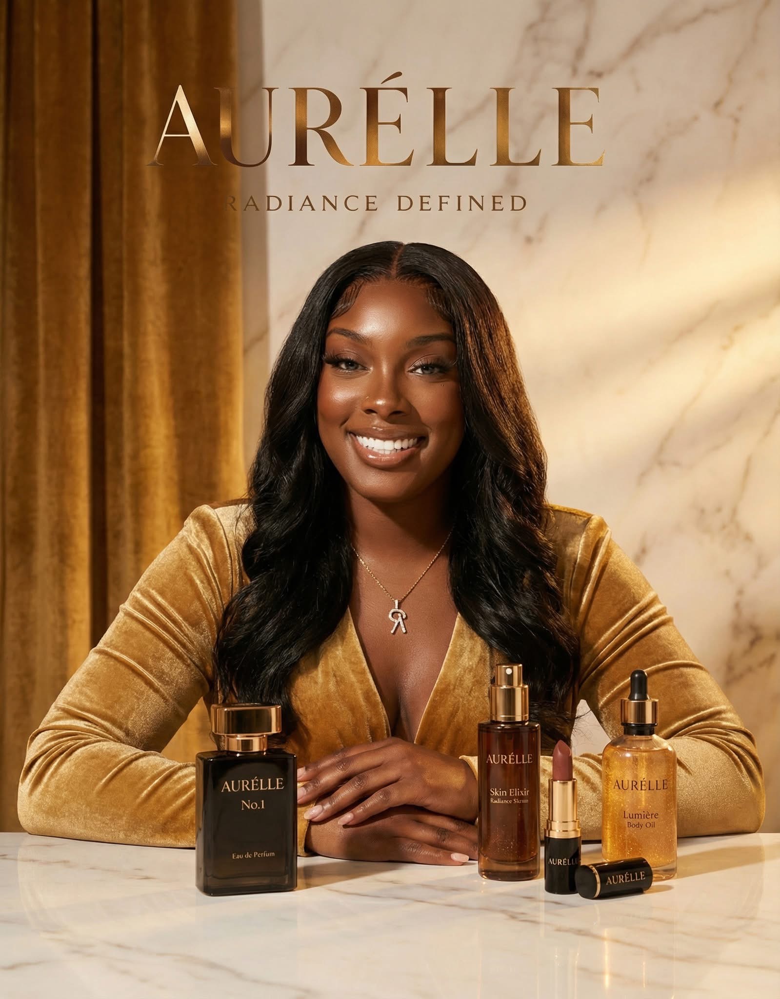
THE BRAND
ALREADY
SEES HER.
Radiance is more than glow.
AURÉLLE explores beauty through the relationship between melanin and light. That relationship informs the products, imagery, campaign direction, packaging, customer experience and complete visual world.
What does premium beauty look like when melanated women are the creative starting point—not an extension of the audience?
A successful beauty brand is encountered as a connected experience.
Campaigns, photography, retail displays, social content, product launches, editorial imagery, e-commerce and the physical product all shape what the customer understands and feels.
LuCre8z developed the system surrounding the product: who the AURÉLLE woman is, what the brand believes about her beauty, how her skin should be photographed, how products should appear on a shelf and what makes the brand recognizable beyond its logo.
Key decision
AURÉLLE exists specifically for melanated women. Its specificity is one of its strengths.
The brand celebrates deeper complexions, varied undertones, rich skin tones, texture and luminosity without reducing Black women to predictable imagery or cultural clichés.
She recognizes quality. She notices packaging. She understands the difference between generic presentation and thoughtful beauty development.
She expects complexion, undertone, color, finish, texture and performance to be considered—and imagery that understands how her skin interacts with light.
BLACK WOMEN ARE NOT AN EXTENSION OF THE AUDIENCE.
THEY ARE THE STARTING POINT.
AURÉLLE was designed as an expandable premium beauty and lifestyle house, not a single-product exercise.
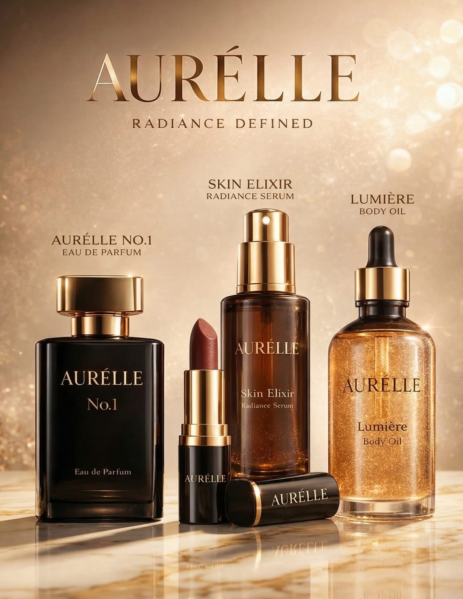
Coverage That Celebrates Melanin. A complexion concept built around undertone, coverage, finish, luminosity and the depth of melanated skin.
Liquid Glow for Melanin Skin. A luxurious body concept using light, movement, reflection, warmth and texture to extend radiance beyond facial beauty.
Restore. Illuminate. Glow. A skincare concept that broadens the customer relationship into ritual, skincare and self-care.
A rich-pigment color concept for deeper complexions, designed to feel equally at home in a high-fashion campaign and an everyday beauty routine.
Eau de Parfum. An intimate, sensual and collectible fragrance extension showing how AURÉLLE can grow into a broader beauty house.
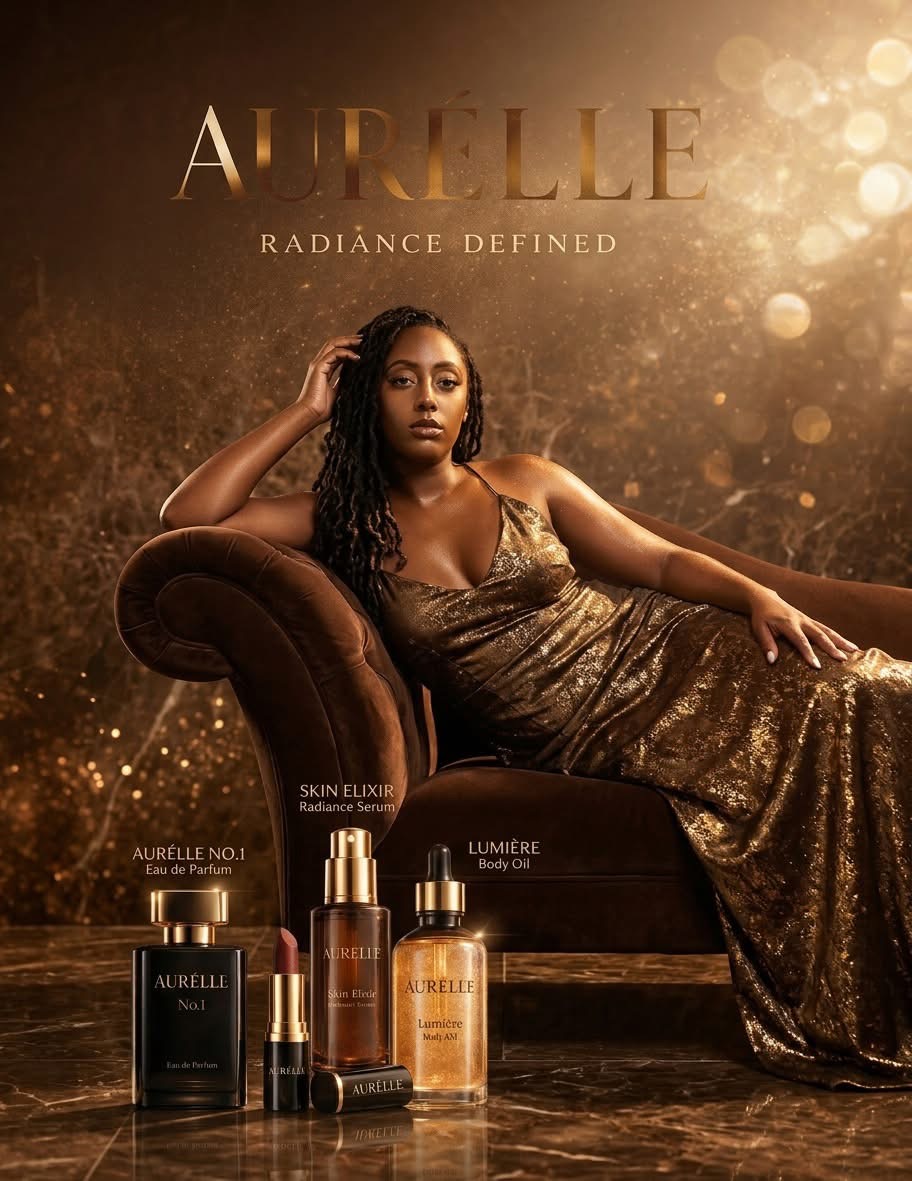
MELANATED
SKIN IS
THE HERO.
Packaging was treated as part of the customer experience—not decoration applied after the product was created.
Form, material, finish, typography, product hierarchy, collection consistency, tactility, photography potential and shelf presence work together to create objects customers would want both to use and display.
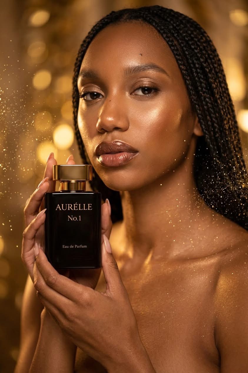
The models do not function as accessories to the product. They establish the emotional and visual world around it.
The campaign direction explores varied skin tones and undertones, natural complexion variation, skin texture, luminous finishes, beauty close-ups, rich pigments, editorial poses, fashion-conscious styling, softness, strength and confidence.
The photography preserves the depth of darker skin. Highlights reveal structure without washing out complexion; shadows add dimension without erasing detail.
Some women represented in the visual development came from the founder’s own community, including friends and family. That gives the concept an authentic range of age, complexion, facial features, hair, style, expression and energy.
It also opens the door to multigenerational beauty storytelling. A mature woman deserves the same luxury, attention, styling and visual power as a younger model.
AURÉLLE’s digital presence brings editorial imagery, brand storytelling, product discovery, product education, shade exploration, routines, texture, commerce and campaign content into one connected experience. The customer experiences the world before being asked to buy from it.
A campaign image creates an emotional connection.
She encounters imagery made intentionally for her.
Product and campaign storytelling build aspiration.
She moves into shades, benefits, textures and routines.
Information reduces uncertainty around the product.
Commerce becomes a natural continuation of the world.
Experience decisions
The proposed customer journey connects seeing herself in the campaign with understanding the product. Editorial imagery establishes presence; shade, texture and routine information would then help her assess relevance.
Retail testers, clear product families and digital education are designed to support the same decisions in different settings. Commerce, formulation, shade testing and retail placement remain conceptual; the completed work is the brand and experience direction.
The concept was developed with a visual system capable of translating into prestige beauty environments without claiming current retail placement or commercial performance.
BEAUTY IS THE PRODUCT.
EXPERIENCE BUILDS THE BRAND.
Brand positioning · audience strategy · brand architecture · customer experience · product-family thinking · retail-facing development
Brand concept · visual language · messaging · voice · naming architecture · creative systems · storytelling
Product concepts · category development · family architecture · packaging direction · naming · presentation · retail thinking
Creative direction · art direction · beauty campaigns · AI-assisted campaign visualization · casting direction · editorial direction · visual storytelling
Digital experience strategy · e-commerce direction · UX/UI thinking · product discovery · customer journey · content hierarchy
Campaign concepts · launch creative · advertising · product and model imagery · social · motion · retail campaign thinking
AURÉLLE demonstrates how LuCre8z can develop an early idea into a larger commercial and creative brand system: a defined customer, culturally specific point of view, brand philosophy, expandable products, premium packaging, photographic language, casting philosophy, campaign world, digital experience and retail vision.
About this concept: AURÉLLE is a LuCre8z-developed concept brand created to demonstrate strategic, creative, product and experience-development capabilities. Retail applications are forward-looking concept directions and do not represent current placement, sales or commercial performance.
Visual development + next stage
The imagery is AI-assisted concept visualization directed, selected and composed by LuCre8z to communicate casting, product presentation and campaign intent. It is not documentation of a completed commercial photo shoot.
The next stage would require formulation specialists, product and shade testing, packaging engineering and customer research before manufacturing or commerce. The portfolio demonstrates the strategic and creative foundation for that work.
Process + deliverables
Develop a beauty concept starting with melanated skin, varied undertones, texture and visibility. This positioning is a creative hypothesis for customer validation, not a claim of completed market research.
Define the audience and positioning; organize the named brand and product families; develop packaging and visual direction; direct casting, light and campaign imagery; map product discovery into proposed digital and retail experiences.
Makiya developed the brand strategy, product-family architecture, packaging concepts, campaign and casting direction, AI-assisted visual references, and digital/retail experience concepts.
Art Direction · Creative Strategy · Brand Architecture · Consumer Product Development · Packaging Direction · Campaign Development · Customer Journey · Digital Experience
A connected concept system and presentation are developed. Manufacturing, formulation, shade testing, retail placement and functioning e-commerce remain future work.
Validate the customer premise and product priorities with representative consumers, then work with formulation and packaging specialists. Test whether customers can understand the range, identify relevant products and find the next step.
Have a beauty, skincare or consumer-product idea?